Indoor Maps Visual Design
Team: Product Manager (1), Mobile Engineers (1), UX Designer (1), Map Team
Time: Ongoing project since April 2017


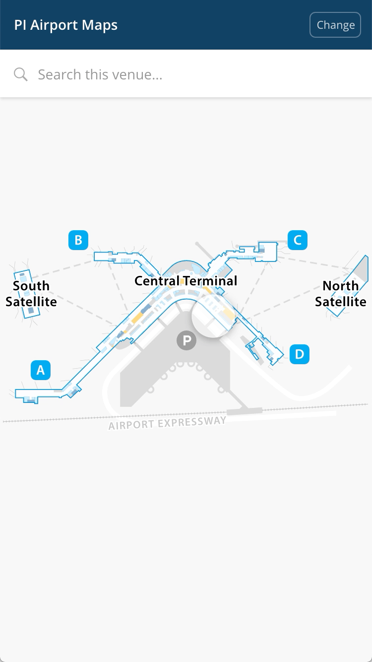
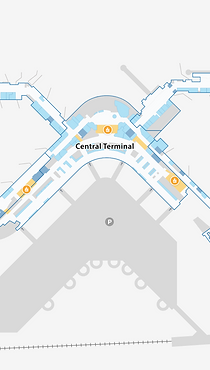
Airport Map
Shopping Center Map
Retail Store Map
Arena Map
Problems
User Scenario
Looking for information on the go with one hand holding the phone
Lack of Visual Hierarchy
It took time to get the most needed information from the map.
Poor Readability
Label treatment and text collision detection

Old Map Screenshots
Design
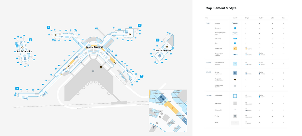
Information to Map
Flight-related, Tenant, Service, Context
Color + Icons
Applied new color palette and created new icons for flight-related info
Label Treatment
Add outline for text labels
Level of Details
Reveal information by the order of importance
Prototype for New Map Design
Level of Details


Level I
Airport Overview
Level II
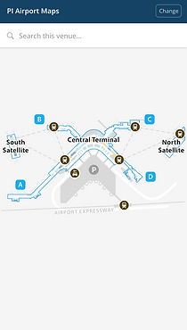
Show Flight-Related Information
Level III
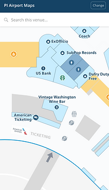
Show Tenant and Service Info
Level IV
Show Facilities and Tenant Category
Style Guide
Variations


Grayscale
for visualizations
Default
Consumer-facing
Dark Blue
for Darkmode and special customers